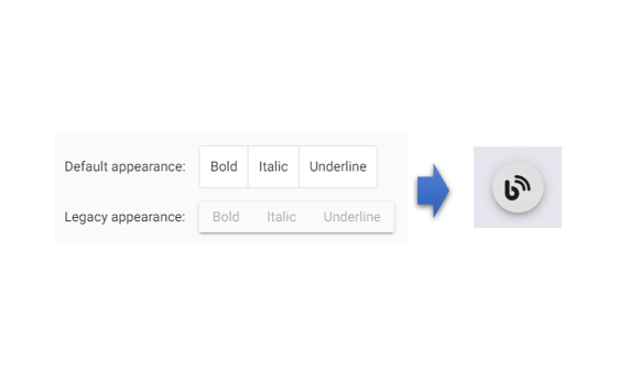
Here's how you can customize the appearance of an Angular Material toggle button. Although the method is unique, I'll explain it in this article.

1. How to use Angular Material button-toggle
Install Angular Material
ng add @angular/materialImport Angular Material button-toggle to Module file
import {MatButtonToggleModule} from '@angular/material/button-toggle'Html
<mat-button-toggle [aria-label]="alertsEnabled ? 'Disable alerts' : 'Enable alerts'">
  <mat-icon>notifications</mat-icon>
</mat-button-toggle>
For more details, refer to the official documentation:
Angular Material Official Documentation
2. Modifying the Appearance of the Toggle Button
The default toggle button has a square appearance. In this case, we'll make it a circular button and ensure that the outline is not displayed when clicked and focused.
Html
<mat-button-toggle mat-fab class="toggle-button" aria-label="blog button" #blogButton>
    <span class="toggle-icon fas fa-blog"></span>
</mat-button-toggle>
SCSS
.toggle-button {
    width: 60px;
    height: 60px;
    border-radius: 50% !important;
    box-shadow: 0px 3px 5px -1px rgba(0, 0, 0, 0.2), 0px 6px 10px 0px rgba(0, 0, 0, 0.14), 0px 1px 18px 0px rgba(0, 0, 0, 0.12) !important;
}

.toggle-icon {
    font-size: 30px;
}

:host ::ng-deep .mat-button-toggle-button:focus {
    outline: none;
}
Feel free to modify the SCSS according to your needs.